Overview- GH LOGO Inse
Grace Hill is a real estate technology company focused on education, compliance, and performance solutions for property management teams.
Problem
As the company evolved, it faced a fragmented brand identity across multiple acquired products. Their existing brand and messaging no longer reflected the sophistication, scale, or forward-thinking nature of their company.
Solution
The goal of this project was to reposition Grace Hill through a strategic rebrand, clarifying their value proposition, modernizing their visual identity, and refining their messaging system to better resonate with enterprise-level clients while maintaining trust within the real estate industry.

Process
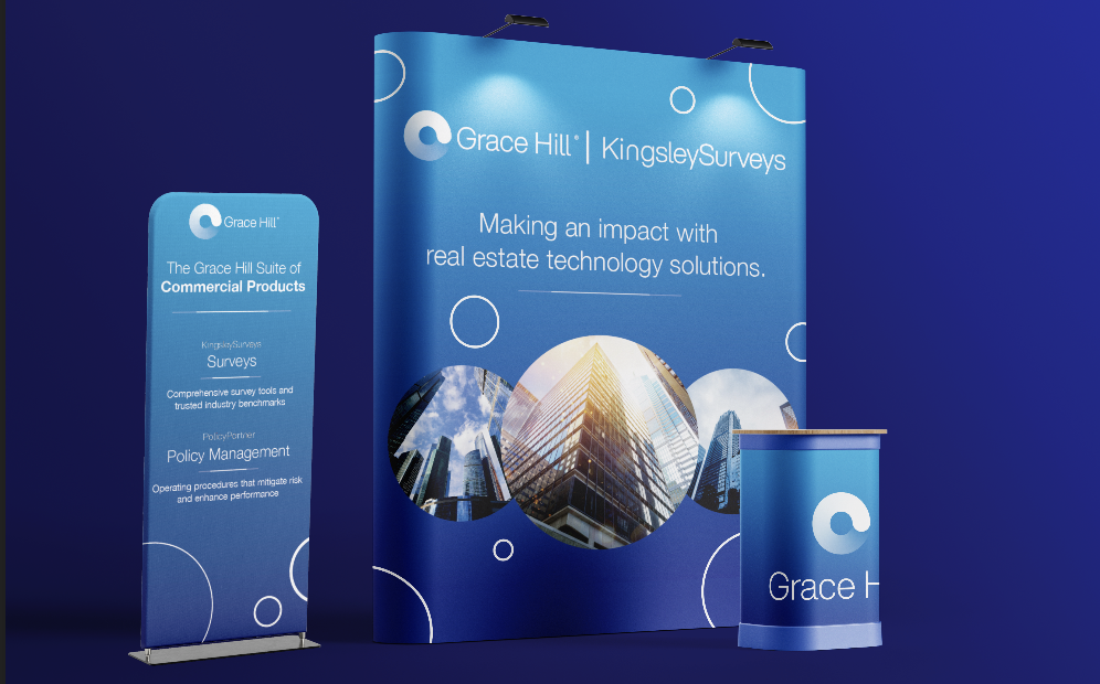
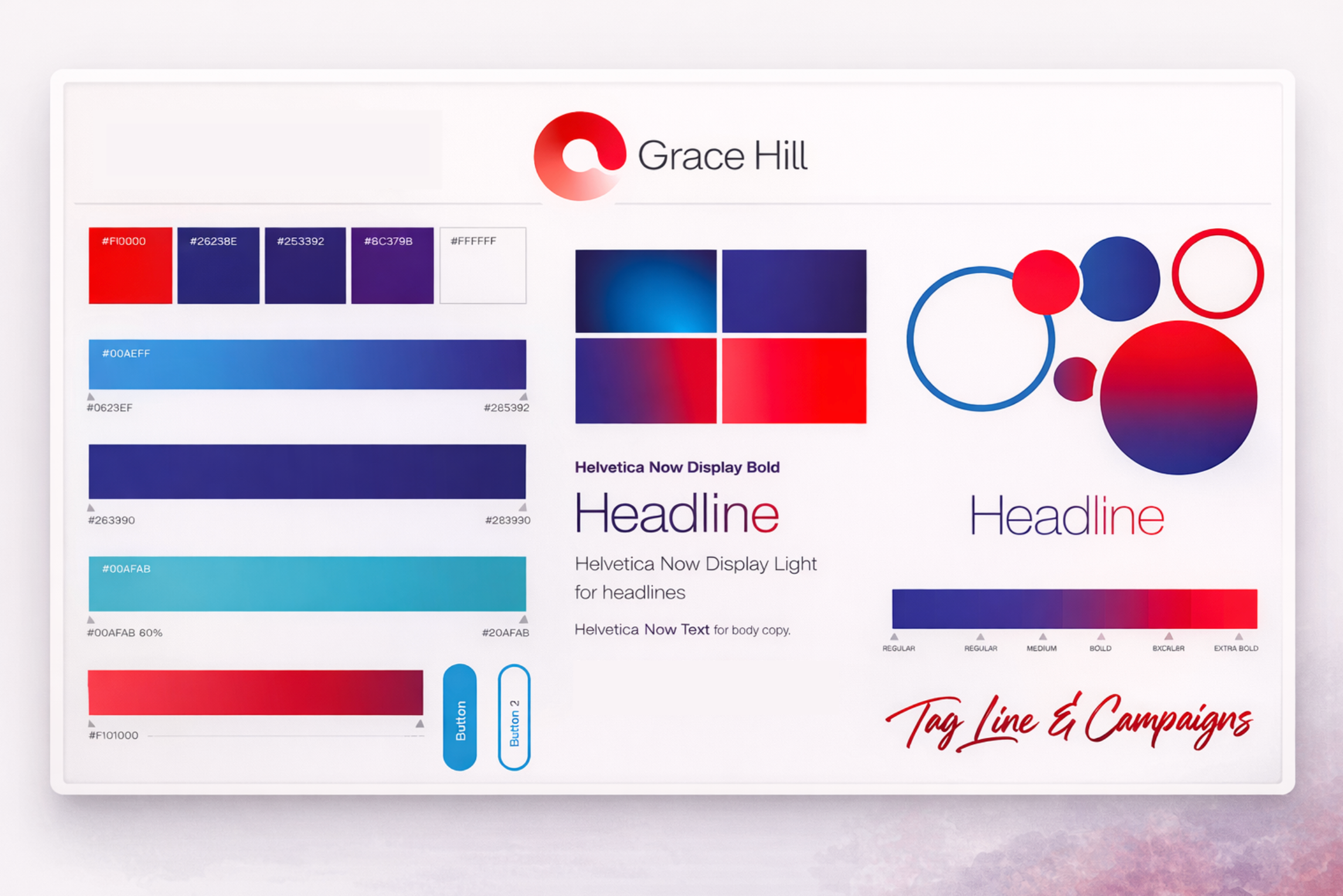
The creative direction drew from Grace Hill’s
bold gradients, clean typography, and a confident red and blue palette. Early iterations explored the balance between innovation and professionalism, resulting in a brand expression that feels both approachable and
industry-leading.
Results
The rebrand delivered a unified, modern identity that strengthened Grace Hill’s position in the real estate technology industry. The cohesive visual system brought clarity to the brand’s diverse products, creating instant recognition across digital, print, and event spaces. Grace Hill’s growth continues to exceed expectations, nearly tripling across all areas.